This is a live review of Qatalog, a potential digital workplace platform for your organization. It’s part of a series where we review products which can function as a new digital HQ for your organization.
Reviewers:
- Vonda Page of Radical Change LLC
- Vijay Anand of The Startup Centre
- Neil Miller of The Digital Workplace
What is Qatalog?
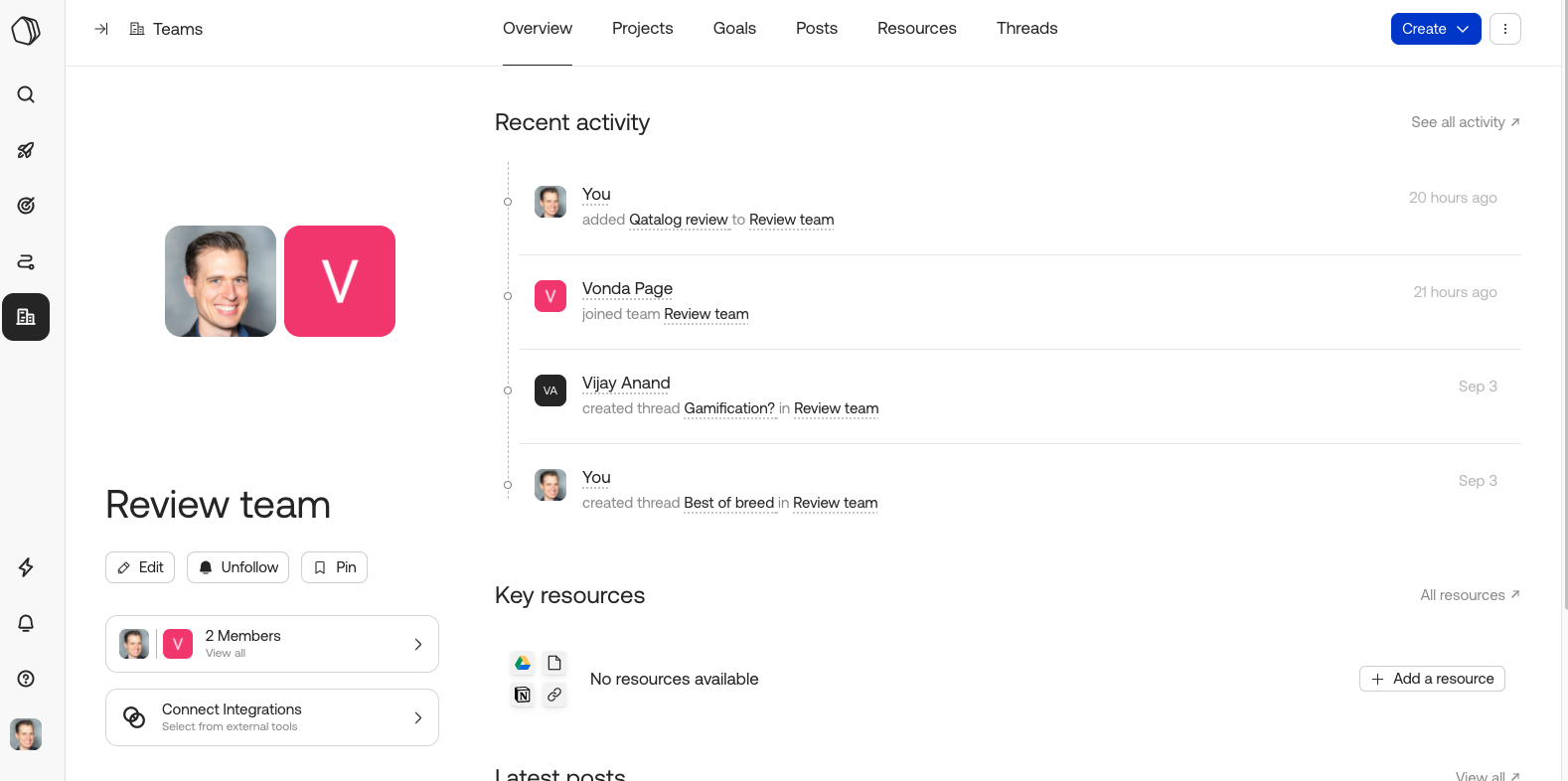
Qatalog calls itself a work hub. It zooms out to take a big picture of what a successful digital business needs to focus on to get all its work done. It has modules for projects, goals, workflows, posts, threads, and teams. It was founded in 2019, and is based in the UK.
Qatalog has invested heavily into the language.work project that talks about a new way of working, very much in align with our views.
What’s our take?
Here’s a summary of our opinions after doing a Qatalog review.
Vonda
Qatalog has the pulse of the end user in mind. They are trying to solve a very real problem.
It’s hard to decide what the pain point is that drives someone to use Qatalog. If they are already committed to using Slack or a project management tool, it’s not clear why they would then add Qatalog. If each team is using a different tool to manage different projects and they want to treat Qatalog like a hub, then the use case is more clear.
It makes sense to use Qatalog if you are onboarding a lot of people at once and starting fresh. But making the transition to Qatalog with an existing team that is using other tools feels like way too much tech debt.
Vijay
Qatalog has a fantastic design. It’s very modern and easy to use.
The whole concept of Qatalog supports a new idea not just of BYOD, but bring-your-own-tools. It seems to prioritize individual teams more than the entire company, and then the way individuals want to handle work more than the team. But that breaks down as it doesn’t support consistent contextual collaboration.
The asynchronous/synchronous split wasn’t obvious to me. Qatalog is quite asynch in its features, but it also tries to integrate with Slack. But that pushes all those conversations to Slack and then you are stuck jumping between tools again which defeats the purpose.
I really like the pulse feature that shows all the activity of people on the team. It gives a feeling like you are in the office and see what everyone else is working on.
It’s hard to identify the one feature that Qatalog does brilliantly. It’s got a lot of things, but nothing stands out. It’s hard to see where Qatalog really builds traction. Each of the modules on their own are pretty basic, and creating a true hub requires a lot deeper integrations that other tools may not be willing to share.
Neil
The customizable homepage is a great starting page. Everyone is going to want something different and it’s nice for people to structure their first screen in a way that suits them instead of forcing a bunch of notifications onto people.
It seems to be great for organizations where individual teams never get above 10 people. And probably no more than 10 teams. After that, it’s hard to see how things stay organized.
I like that they brought in two essential parts of teams that are often missing from other platforms: resources and goals. Resources are durable communication items that people need access to often. And goal management is only now getting the attention it deserves from tools. So, I’m happy to see those here.
They are bold to declare what are all the essential work elements of a great team. But each of those requires a much more complex solution than Qatalog offers.
Qatalog pricing
Check their pricing page for the latest details, but as of this recording, Qatalog is free for teams up to 9 people. For larger teams it is $9/user/month.
Live Qatalog review
Other reviews
Clickup review
Friday.app review
Kintone review
Twist review
Swit review
)
)
)

